Facebook’s new user interface design for better user experience.

The old Instagrammers would surely remember the sudden makeover of Instagram’s logo from a detailed camera lens to a flat colorful gradient. Redesign of Instagram’s logo and application in May 2016 was a major breakthrough that extensively jacked up its user base. Post it, Instagram has witnessed commendable growth from 600M (December 2016) to 700M users (April 2017) within a period of just 4 months. Speeding together with modern aesthetics, Instagram has been taking good care to keep the user-shared content in spotlight with minimal layout. Even its sister brand, Facebook started looking old beside it. Here’s where a redesign of Facebook’s new user interface was relevant for better engagement.

Take a closer look at Instagram’s evolution here.

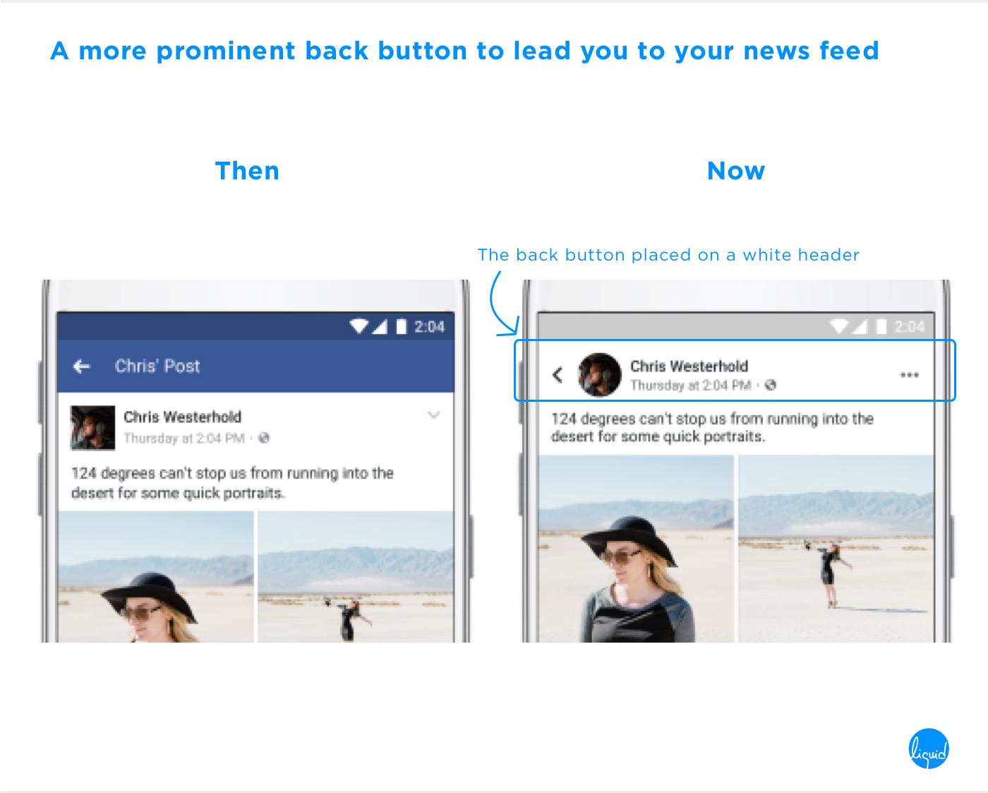
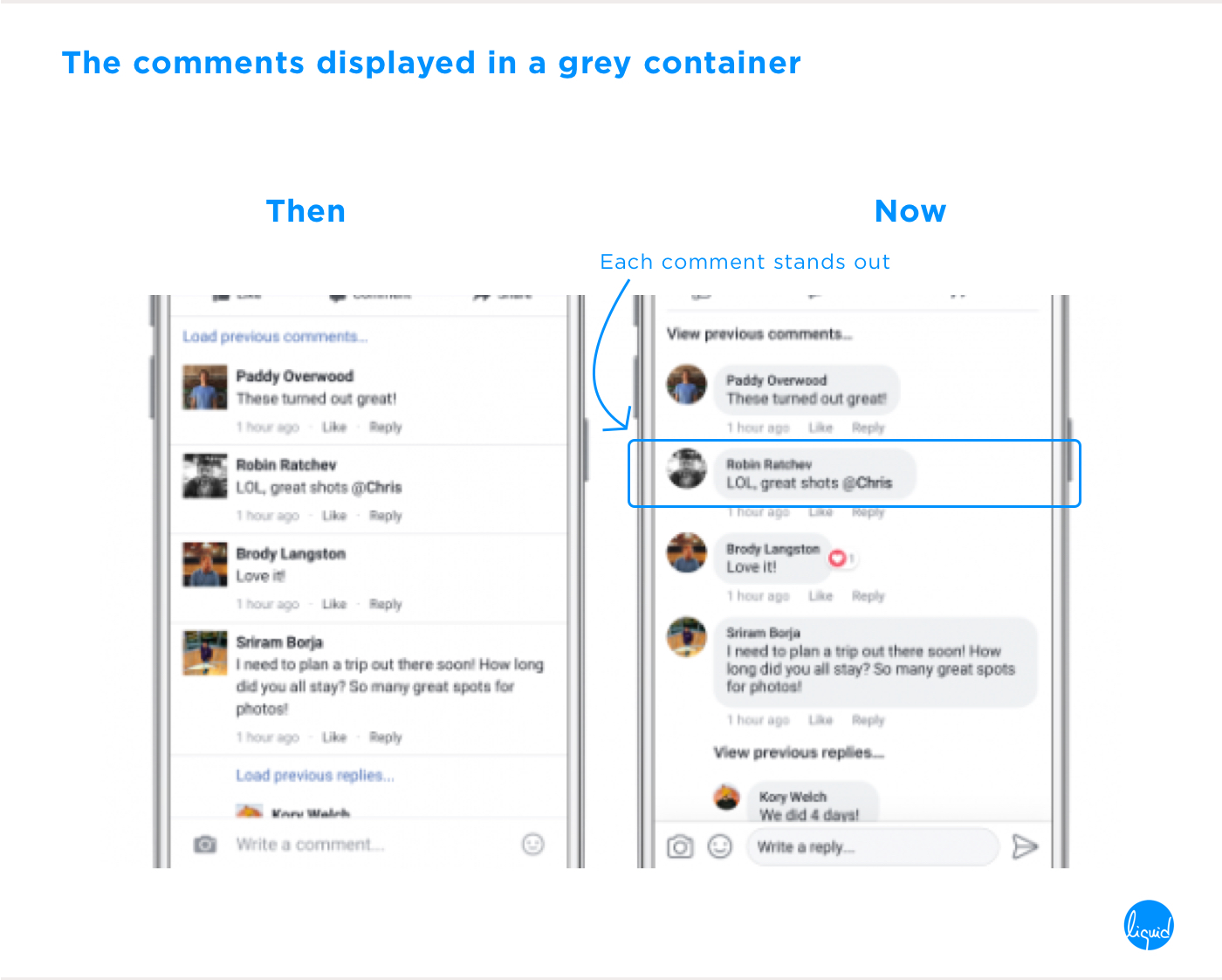
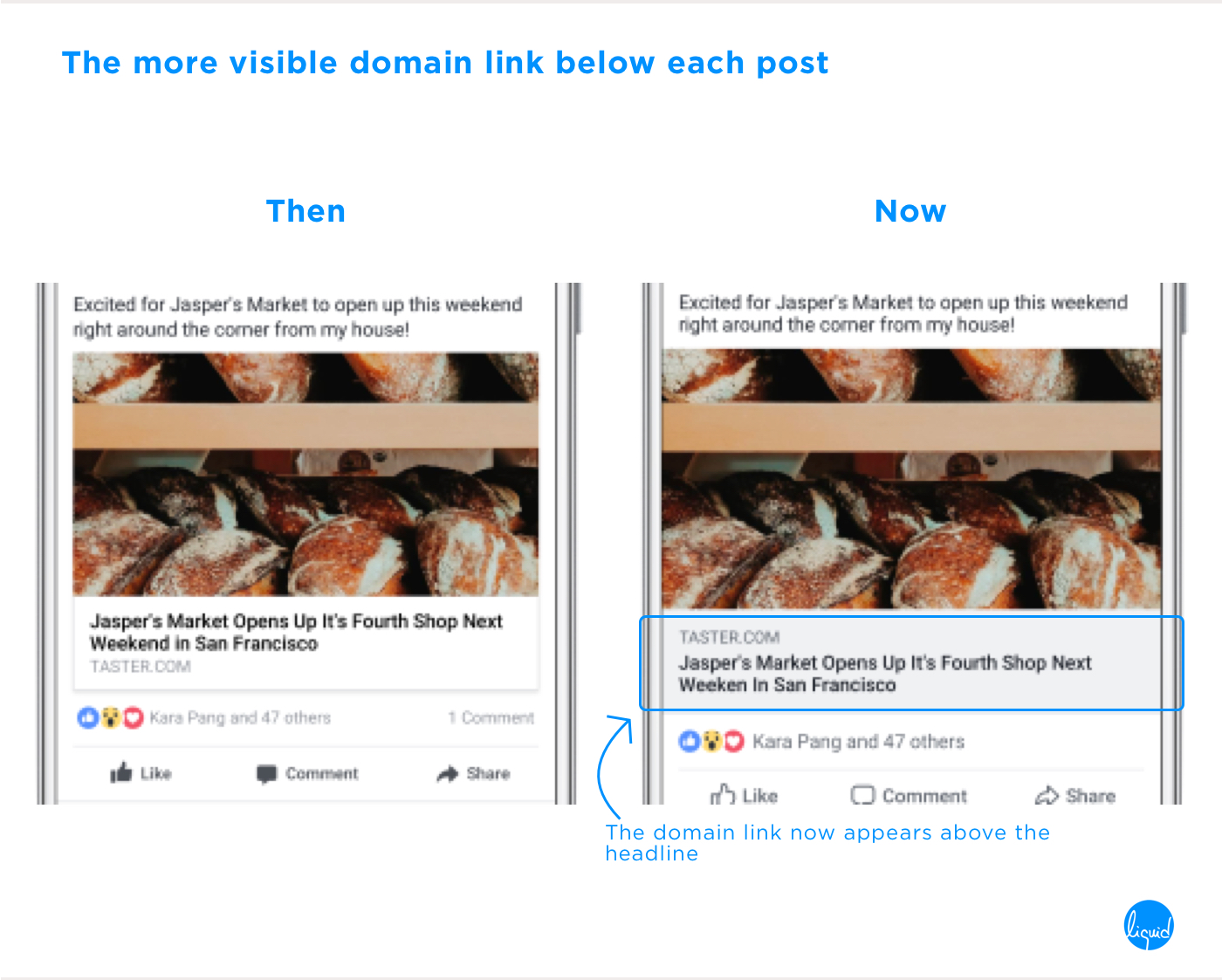
Unlike Instagram, Facebook has always maintained consistency and never revamped its interface all at once to a high degree. The reason could probably be that Facebook is an extensive software and changing it largely would cause confusion among the users. It seems to have reached a point where it had become inevitable for it to better up its user experience by making some small tweaks. Facebook’s new user interface has adopted a philosophy where it lays emphasis on its posts. Looks like some inspiration has been taken from Instagram itself, which displays substantial breathing space to focus on images.

Here’s how Facebook’s new user interface targets to achieve an easy and trouble-free experience.

Keep a track of where you go

No doubt, Facebook’s news feed witnesses one of the highest figures of traffic and engagement. Being an extensive and vast social media platform, it is possible that the users adrift between the layers. Facebook’s new user interface has a restructured navigation. It lets users directly go back to an obvious home page from a post or link. The header appears with a prominent and predictable black arrow button which takes you back to your news feed after you have viewed a post.

Get an eye for circles

Facebook has dumped the little too aged feel of its icons that had remained consistent throughout to retain the application’s identity. So far, it has responded to changing trends with only minimal alterations that were less noticeable by the users. Although, this has allowed them to stick to the application. Catching up with the modern image of aesthetics, it has redesigned its icons with a young and fresh visual appeal by giving them outlines and rounded edges. The profile pictures now give a more human feel as they have changed from squares to circles.

Bringing it to your finger tips

Your social network is hyperactive and you are curious to dig into each post that stacks up into your feed. The degree of activities taking place on this application are much higher as compared to any other. As a result, everything becoming a part of one’s life demands ease and control. With the intent to accelerate interactivity on the platform, the size of the icons has become slightly bigger. Consequently, the icons have become easily tappable, furthermore, enhancing the clickability.

Know what you see

Some promotional posts are greeted or responded with numerous comments. Facebook’s new user interface has marked a distinction between the direct comments and the threads for better clarity. The direct comments now appear in a grey container which has made it easy to distinguish each comment by making them stand out. The domain link below each post now looks more prominent than before.

Experience better optical clarity

We cannot imagine Facebook dressed in something other than blue. The text and icons placed on blue need to be comparatively more legible as to those placed on white. A slight increase in contrast (merely visible) has increased the readability and enhanced the text and visibility of elements.
Take a quick glance at the redesign here.

Takeaway – Continuous improvisation of UI and UX can only keep you stay ahead of others in the game.

In recent years, designing a website or an application has been much more than just one-time exercise. To be precise, it has become an opportunity for continuous innovation. The practice of endless upgradation is aimed at enhancing the user’s experience.

Among youngsters, social media occupies a major portion of their regular time and attention. It is fast becoming the only source for social interactivity.

Social media platforms have already realized it. Each improvement in UI and UX of the application thrives to reduce visual fatigue, tension and hindrance while surfing. Hence, the focus remains to better up the user-experience and stay ahead of the competition.

Don't forget to share this post!
Next